Friday 22 October 2010

ideas for preliminary task

Title-
The title needs to stand out and be something that you will remember
Many titles use clever techniques such as alliteration
You need to be able to identify what type of magazine it is and who it is aimed at from the title.
Titles are usually short

Ideas for my title-
  • Pupil plus-This would be easily remembered and would stick in the memory. Its a clever title. It would appeal to the pupils of the school rather than adults
  • Student supplement- This also uses alliteration. It would appeal more to older readers and parents. It sounds sophisticated
  • HUS !- This title is very short and so it would be easily remembered. It would appeal to younger audience. Students and parents of the school would know straightway that the magazine is all about Harlington upper school
  • The Heart of Harlington- The title is very memorable and the word heart implies the magazine is at the centre of the school.
  • Focus- This title would appeal to the parents and sounds professional. It is not as memorable as the other titles
I have chosen to use Pupil plus as the title of my front cover for the preliminary task

Monday 18 October 2010

Research-Analysis of school magazine contents page


  • The colour scheme is yellow,black and red. These colours really stand out and would make readers stop and want to read the page.
  • There is a large title at the top in large and colourful font. You instantly know what it is and it grabs your attention. " This week in Beat"
  • The image on the page shows the main story. It highlights what the magazine focuses on. This is a very popular convention for contents pages.
  • Along one side of the page is three main headings in bold,white writing on a black background. This makes it stand out on the page and makes the page easy to navigate.
  • Under each heading are several bullet points which tell you about certain features in the magazine. Each bullet point tells you which page to find that feature. This makes it a lot easier for readers. Page numbers are also in red colour. This highlights the important parts of information.
  • At the bottom of the page is a section advertising subscription. I think this is a good idea and is a widely used convention on contents page
  • There is a lot of text on the page and gives readers a lot of information. It tells readers what main stories are and how to navigate the magazine. This contents page is very good 

Friday 15 October 2010

Research- analysis of school magazine cover

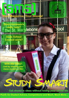
This is a school magazine cover that i can analyse to help me with creating my own cover
All magazines follow certain conventions,and this magazine is no different

  • There is a large masthead at the top of the page. It is very eye catching and you immediately recognise the magazine. It is in large writing and very bright colours. This helps the reader pick it out form other magazines on the shelf. I think this technique is effective
  • There is a slogan or banner underneath the masthead. It is in yellow writing and is quite difficult to read. It is too small to read and should be bigger
  • There is a large image in the middle of the magazine cover. This is the main attraction and your eyes are drawn to it immediately. It is of a school girl and it makes it clear what the magazine is about. The background is very clever as you immediately know it is in a school. It is accompanied with a headline that stands out from the rest of the text because of the colour and size. The headline anchors the picture very well and shows main story.
  • The subheadings on the cover are in green boxes and at one side of the page. There is very little text so it looks attractive. The boxes jump out at you and i think this is a very good technique.
  • The colours on the page would attract a younger audience of teenagers and i think the colours make it stand out from the rest. You would be able to pick it out because of the very distinctive house colours.
  • You can clearly see from this front cover what the target audience is. It would appeal to teenagers who are at school and this is what i want to do. This magazine also follows all conventions and is very clever in the way it has been designed