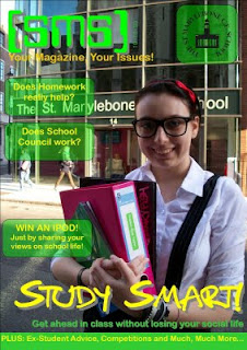
All magazines follow certain conventions,and this magazine is no different
- There is a large masthead at the top of the page. It is very eye catching and you immediately recognise the magazine. It is in large writing and very bright colours. This helps the reader pick it out form other magazines on the shelf. I think this technique is effective
- There is a slogan or banner underneath the masthead. It is in yellow writing and is quite difficult to read. It is too small to read and should be bigger
- There is a large image in the middle of the magazine cover. This is the main attraction and your eyes are drawn to it immediately. It is of a school girl and it makes it clear what the magazine is about. The background is very clever as you immediately know it is in a school. It is accompanied with a headline that stands out from the rest of the text because of the colour and size. The headline anchors the picture very well and shows main story.
- The subheadings on the cover are in green boxes and at one side of the page. There is very little text so it looks attractive. The boxes jump out at you and i think this is a very good technique.
- The colours on the page would attract a younger audience of teenagers and i think the colours make it stand out from the rest. You would be able to pick it out because of the very distinctive house colours.
- You can clearly see from this front cover what the target audience is. It would appeal to teenagers who are at school and this is what i want to do. This magazine also follows all conventions and is very clever in the way it has been designed

No comments:
Post a Comment