Friday 10 December 2010

Questionnaire

      This is the questionnaire that I have asked my target audience to fill in about my magazine. I will now look at the results and could change anything that has been highlighted. 10 people filled in this questionnaire

   1. Do you think the colour scheme works well?
   2. What would you change about the layout of the page?
   3. What is your favourite and least favourite image?
   4. Are there enough images in the magazine?
   5. Do you think the text/images integrate well together and are positioned correctly?
   6. is the text readable?
   7. Is the text understandable and do you think the grammar and spelling is perfect?
   8. Does the style of the magazine represent the genre?
   9. Do you think the magazine is appropriate for the target audience? Would you buy it?
   10. What do you think is really good about the magazine?
   11. What would you change about the magazine?
   12. Any other comments

Double page spread

Click on the image to enlarge and view text

Contents page

Thursday 9 December 2010

Front cover

This is my final front cover. I have created it on publisher and will now get some feedback on it. I will then make some changes to it if i feel i need to


Monday 6 December 2010

Images-cropping

I have used macro media and paint to crop some of my images that i will use in my magazine. I have removed the background on some of the images. I wanted to remove the background as it puts more focus on the band members in the image and makes the image look professional. I have also cropped them down to the size that i want


.

Thursday 2 December 2010

Article for double page spread

Ulterior Motive-Exclusive Interview
Ulterior motive burst on to the rock scene in 2008 and they haven’t looked back since. In only 2 years they have released a debut album that has shocked the music world, won best British newcomer of 2009 and are heading out on their debut tour later this year. Not only that but in august they will finish off the year in style, performing at Reading and Leeds festival.
Only two years ago these two were unknown in the music world and could only dream of being in the spotlight in front of millions. They became famous overnight and   struggled with the pressure. They are never out of the public eye and unwanted paparazzi coverage nearly pushed them over the edge.  Their success has surprised many critics and inspired amateur bands across the country to push for the big-time. We caught up with them at their recording studio in Camden as they begin to record their new Album!
You’ve become a worldwide hit in only 2 years! How did it all begin?
We knew each other from school and were all brought up in London. We were in a band at school but when we left school we lost contact. We hadn’t spoken for years when I got a phone call from adam and he wanted to meet up. We decided that we would form a band in our spare time
 So did you ever believe you would get this far? No.  We never took it seriously at first,it was just a hobby.I knew a few people in the industry and was able to get us In contact with a recording label. I didn’t think anything would come of it but one day I was on the tube heading home when I got a call. They wanted to sign us up.
Was it that easy? Of course not! At first money was short and we were not sure that we would ever make it. The record label were so supportive and we have to thank them for our success. It’s all down to our hard work and the passion we have all put into making this band a success
How difficult has it been to deal with all the media attention?
Well obviously it wasn’t easy. There have been points where it has been difficult to keep our feet on the ground and remain ourselves. The first album was such a hit and we were appearing in the media every day. We felt under such strain to please fans. We had many critics at first and that was hard to deal with. Everything we did was picked at. We were under pressure from the record label to be successful.

The new album “just the beginning” is out in late January next year. It promises to be a huge success. “ Its sounding heavier than the last album. We wanted to experiment with sounds” It will be a new twist on the genre of rock and is set to be a world wide phenomenon! “We are sure it will be even better than the first album” .Vertigo will keep you up to date with the progress and bring you all the latest news on the album

Plan of contents/double page spread

Double Page Spread-


Tuesday 23 November 2010

plan of front cover

This is a draft of the layout for my front cover. This is how i want my final cover to be set out.
I can now start to create the final front cover

Planning- Images

For my magazine i need several images of a rock/punk band and of individual artists. To get these images i organised two photo shoots
  • I  arranged to meet with a band that play at a local village hall every week. This means i could get several shots of the band while playing as a group. It also meant the photos look natural and realistic. I will put this band on my front cover and they will be my featured band
  • I also arranged a photo shoot with Friends. I took images of them as a band and individual artists and will chose the best ones.
  • I have also been using the music department to take images of instruments for my magazine
I have taken around 50 images. These are some of the best ones that i can use in my magazine.


Friday 19 November 2010

Planning- colour scheme

My magazine needs to be recognisable and have its own identity. Many magazines like Kerrang,The word and Q all have their own distinctive logo,slogan and colour scheme. The masthead also needs to be recognisable and be instantly recognised as part of the brand like this masthead
Masthead
These are some of my ideas for the masthead of my magazine


House colours
The main colours i will use in my magazine will be black,red and white. These colours represent the genre of rock/punk and would appeal to my target audience. It would make the magazine instantly recognisable. In most rock magazines i have seen these are the main colours that are used regularly


Planning- key themes of my magazine

Genre-
I have chosen to create a music magazine that focuses on the genre of Rock/Punk. I have chosen this genre because rock magazines all follow very similar conventions. I will be able to manipulate these and create my own music magazine. I have also looked at Kerrang! in detail and i understand what this genre involves

Target audience-
My primary target audience will be young males and teenagers between the ages of 14-20. The audience will be mainly British and will be middle class. My audience will be people who live a mainstream lifestyle. It will be a niche market of rock and punk fans.
This is a group that i understand and i will be able to produce a magazine that this age group would enjoy. This age group are also more likely to be fans of the genre Rock/Punk.
My secondary audience will be females of a similar age. They will also be middle class and fans of rock.I will have to include features/articles that will appeal to this audience as well.

It will be a weekly magazine and will be out in the shops every Tuesday. I have chosen this so readers can keep up to date all week and because tuesday is the middle of the week. The price of my magazine will be £2 as this is a common price and is not too expensive

Name of magazine-
I have come up with several ideas for a name that will appeal to my audience-
  • Vertigo
  • Discord
  • Snare
  • The Limit
  • Paralysis
  • Rebellion
These names are all short and would jump out at the reader. I think they are all interesting and would appeal to the target audience. They are all appropriate for the genre.
Vertigo will be the name of my magazine

Aim of magazine -
Vertigo is a music magazine that aims to provide fans of rock and punk with a magazine they can get involved in and stay up to date and in contact with their favourite bands and artists. Vertigo is a magazine fuelled by passion and enthusiasm for great music

Research-Double page spread 2

This a a double page spread from NME. It is similar to the one i looked at from Kerrang! but is uses a different layout style
  • The main image is very large. It takes up one whole side of a page and half of the other. It is a posed photo of a band. They are all looking at the camera and look powerful. The page completely revolves around this image and the background of the image makes up the background of the page. The image is bright and gives the page a positive feel
  •  In the top right hand corner is the title of the page. The text is very bold and is white. It is in front of a blue background so it jumps out at you. The blue colour makes it seem less serious and fun
  • In the bottom left hand corner is another blue insert. This is a profile of the band. It is quite small and is not very noticeable
  • In the right hand corner is the text. It is in a white text box and includes its own heading which is in large black font so its made to seem important. There is not much text and it is very small. This makes it slightly harder to read.

Thursday 18 November 2010

Research-Front cover/contents page 2


NME is a very diffrent style of magazine from Kerrang! and has a diffrent audience therefore many aspects of the cover and contents page are diffrent. However they both follow similar conventions
Front cover-
  • The house colours are red and white. These colours give the magazine a more cheerful feel and make it seem modern and for a wider audience
  • The masthead is large and in bold and bright colours. It is positioned behind the main image
  • There is a main image that takes up the whole of the right side of the magazine. The image is from a low angle and they look powerful and important. They look like a neutral band for fans of all genres of music.
  • The headline is in red and spreads accros the main image. It is large and anchors the image. It stands out on the black background
  • Along the left hand side of the page are the subheadings. They are also in red in bold. Below the headings is a small amont of text in black. It does and do not include any images and so it is not the main focus of the magazine
  • There is a small,black insert in the shape of a circle at the tiop left of the page. It includes a small amout of text. This makes the magazine more interesting
  • As usual there is a bar code and information about issue number and date in the bottom right hand corner
  • The background of the magazine is white. This is unusual and gives the magazine a neutaral feel. 
Contents page-
  • At the top of the contents page, in a black banner is the title. This immediatly tells the reader that it is the contents page
  • Along the right hand side of the page are five seperate headings. This is very similar to Kerrang! magazine. The subheadings stand out as they are in white font on a black background. Under ecah heading is information and page numbers that tell the reader where to find everything in the magazine. 
  • In the centre of the page is a large image> this is thefocus point and is accompined with a paragraph of text. The large image makes this page more attractive. 
  • At the bottom of the page is a promotion for subscription to the magazine. This is another thing that i have found in several contents pages. It is in a black insert and includes images. It grabs your attention
  • Along the left hand side is an index that spreads all the way down the page. The text is very small but is in a red clour so it is redable and more attractive
                                                                                                                                               

Research- Double page spread 1


  • At the top of the page is a very large title that spreads across both pages. It is in two different colours so it stands out and is attractive. The black and red colours are very specific to rock genre. The title tells you immediately what the article is all about
  • There is a very large black and white image of an artist. It is the focus point and it anchors the main article. In most pages i have seen all include several pictures. This picture almost takes up one half of the spread. It makes it a lot more interesting and would make the reader take interest in the page
  • The maim image of the artist has been taken from a low angle and is looking up at the singer. This makes the artist look dominant and very important
  • There is quite a large amount of text but the language is informal. The font is white,on a black background so it is easy to read and stands out. The text is all in the top half of one of the pages and is surrounded by images. One section of the text is in a white,rectangle shaped box. This makes the text seem more important than the rest
  • This page sticks to the same house colours of the front page and contents page and would be easily recognised as part of Kerrang! magazine. The background is very dark and all the images are in black and white. This is specific to the genre. Parts of the text are in red. This jumps out at you off the black background.
  • The language used is very direct towards the readers. It would make a reader feel like they are involved. The language is also being used to advertise the artist. Powerful statements like "The best" and "exclusive" are used for emphasis

Tuesday 16 November 2010

Research- contents page 1

This contents page is also form Kerrang! and is aimed at young males and teenagers who are fans of rock/punk
  • The contents page sticks to the house colours used on the front cover and you would be able to identify it to Kerrang!
  • The text on the page is bold and bright. It is also made clear that it is the contents page at the top of the page 
  • There is a lot of information on the page. It includes the issue number,date released etc. This is very similar in all contents pages i have seen
  • At the top of the page is a comment form the editor. The editor gives a short comment on this issue and addresses the reader directly. It is also accompanied by a small image that makes the text seem more attractive  
  • Along the right hand side of the page are nine separate sections that include news,features and gigs. This makes the page easier to navigate and the sections make it easy for the reader to find  what they are looking for in the magazine. The headings are in yellow and black and they stand out.
  • There are a lot of images on the page. The images take up the centre section of the page. Under each image is a small amount of text. This makes the page more interesting and the reader would be more likely to look at the page. The images are all specific to the genre of rock and are very colorful
  • At the bottom of the page,in the right hand corner is a promotion/advert. It is advertising the service that Kerrang! provide. In most contents pages i have seen this is very common. The promotion is in very bright colours and your eyes are drawn to it

Research- Front cover 1


From the research i conducted when doing the preliminary task i  know what to expect from a magazine and all the common conventions that they follow. Music magazines are no different but they do have a very distinctive style. Kerrang magazine is aimed at teenagers and younger men. It is for the music genre of punk/rock and you can see this in the design of the cover.

  • The masthead is in dark colours on a white background and the text is bold and quite modern. The connotation of the colour black is negative and of fear. This reflects the audience and genre for the magazine. Above the masthead is a banner that includes text. This text is also white on a black background
  • The house colours are red,black and white. All of these colours represent the genre of rock. The colours also make it more attractive to the reader and would make it instantly recognisable.
  • As in most magazines there is a large image in the centre of the page that takes up most of the space on the page. I have learnt that this is very common in all magazines. The image is of a rock band that are all dressed in similar clothes and in a style that represents them. It is a posed photo and they are positioned behind each other. The image is the first thing you see and is the focus point of the cover. It gives the reader an idea of what the magazine is about
  • There is text positioned in front and behind the main picture. The text is in bold and is very large. It has to stand out so readers are attracted to your magazine first. The more important text is highlighted in red. There is not much text on the cover 
  • There are a lot of images on the page.There are three pictures at the bottom of the page. These are all of music artists and would attract fans of rock genre. They are medium sized and in red and black boxes. These pictures are all accompanied by a small amount of text. Above the image is the headline"poster special". It is in a red arrow shaped box. This empathisises the importance of the text and makes it attractive 
  • The Language used is very simple and would be the sort of language that the target audience would use. The language is also very Strong and powerful like "storm" and "uproar"
  • At the bottom of the page is a small banner. It includes bullet points that highlight important articles
  • All of the magazines i have looked at include a bar code in the bottom corner of the page.

Research for Main Task- Key terms

I have finished the preliminery task and i am now starting my research and planning for the main task

Music magazine- Is a magazine dedicated to music and music subculture
Connontaion-  the meaning that you infer from what you see. It is like the hidden meaning. example- The colour red makes you think of danger and passion
Denotation-This is what you actually see. what is  the image shown on the page actually is.
Ideology- Represents the ideas about social groups and values. It is the beliefs that we share as a society. Moral values
Audience- A  group of people reading any media text. Audiences are those who the media is aimed at.
Representation- Representation of the British Society or a certain age group or gender. It represents society in a certain way.
Institution- Organisations? newspapers/ newpapers etc. An institution is a group that produces a media product. Example-Kerrang

When thinking about creating my music magazine i will have to keep all these terms in mind and use these definitions to give me an understanding about what a music mag should include

Tuesday 9 November 2010

final preliminary task- Contents page

This is my final contents page. I have stuck to all the conventions and expected layout, style and design of a contents page. I have included a large title in bold writing and have made it clear that it is the contents page. I have used the house colours of blue and made it colorful and attractive. I have 3 main headings which i have used to split the page up so it is easy to navigate. Under each heading is informative text that explains what is in the magazine. I have used two large pictures that relate to the stories on my contents page. I think this contents page would appeal to my target audience of teenagers as it is colourful,bright and includes several images which all make it more attractive. I have also made sure that i have not included to much text but it is still informative and tells the reader what to expect in the magazine.

Monday 8 November 2010

final preliminary task- front cover

This is my completed front cover. All my research and planning has gone in to making this. I have used a large,bold and bright masthead. This would stand out and attract my audience. My masthead is catchy and the title would be remembered. I have used the house colours of blue and green to appeal to both genders and make it look attractive. The focus point is the large image in the right hand third of the cover. I have used a large image to draw attention to the magazine. I have a large heading over the main image and this would be the first thing the reader would see. I have two subheadings along the left hand third of the magazine. They are underlined and bold so they stand out and each includes a photo.At the bottom of the page i have included a banner which tells readers what is in the magazine.My front cover would appeal to my target audience of teenagers and i have met my aim.

Friday 5 November 2010

planning- cropping and manipulating images


These are the images i will use on my magazine. I have cropped and edited all of these images. They have been improved and will look better on my cover. I have used paint, macromedia and publisher to edit my images. I have also removed the background from one of the images which i will now use as my main image for my front cover
Title-
I have also been working on the design of my masthead. I have decided to use a retro style. In bold black text so that it stands out and will make the magazine instantly recognisable. This style will also appeal to my target audience (Teenagers) as it is a modern and stylish design


Wednesday 3 November 2010

planning- Images


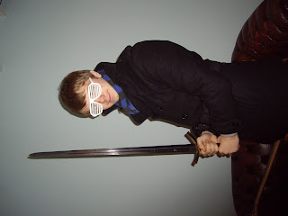
I have taken around 30 images. These are some of my favorite images. I can use these in my front cover and contents page for the preliminary task. I took these photos around school and organised an actor to be in be pictures. I carefully thought about location of photos. I have experimented with several shot types.angles etc
I will choose the best images and crop/manipulate them.